In what ways does your media products use, develop or challenge forms and conventions of real media products?
This is the question that will provide me a challenge in explaining how I have used research from real media products (e.g. Mainstream music video) and how I have incorporated it in to my piece of media product. I will also refer to my ancillary work also and how I have used previously made advertisements as a guide for my own.
Firstly, I will be discussing which videos I was influenced by and how I effectively took some of its ideas in order to make the best possible low budget music video. I have blogged about this before and i will be using it to remind me. An inspirational video was a song by SBTRKT - "Hold on" in which I came across whilst studying the artist of my chosen song. The video develops the idea of having a contrast between the lyrics and the visuals presented to the audience. The lyrics are somewhat hypnotic and mysterious since it is about two people growing apart due to a crumbled relationship but in the end the situation is still ambiguous. The word "why?" is repetitive in the lyrics and this suggests that the song is pessimistic and dark, contrasting the consistent use of a dark setting of a night sky throughout the entire music video.
The comparison here are somewhat similar but a little bit differentiated, the song we chose was "Right thing to do" by SBTRKT. The lyrics here are also dark and the theme is identical. A quick analysis here would be the repetition use of "walking alone" in the lyrics of this song, suggesting someone sad. Therefore we have developed this idea and our group decided to use a medium to dark setting throughout the entire video, the idea here was not to put any shots that were very bright since it wouldn't reflect the songs lyrics through its visuals to the audience. We couldn't film when the sky was pitch black because we have a low budget and do not have professional lighting equipment. During the early stages of our filming we made an error and done a few base tracks in direct sunlight but we quickly acknowledged this and changed our filming schedule to a time where the sun is not present or when it is just about to get dark. You will see a screen shot of every location used in our music video, in comparison to the video that inspired us.

Going back to the quote where I said "The video develops the idea of having a contrast between the lyrics and the visuals presented to the audience", this relates to the Andrew Goodwin theory of music videos. We decided to follow the convention of "Amplification" which is when the visuals introduce extra meaning on top of the lyrics itself but does not contradict the lyrics. I thought at first that it would be "Illustration" but our teacher gave us an example such as, when the lyric says "Outside a cafe on Thursday 29th" and the visuals would be shown a calender outside the cafe with the words - Thursday 29th". Our video does not simplify in this way so it has to be under the amplification theory. Our video also does not fall under the "Disjuncture" theory of the visuals contradicting the lyrics, my explanation on the previous paragraphs show that the visuals do have a link to the lyrics. I have done a blog post about this theory a few months back, a screenshot is shown below.

Laura Muvley's theory of "dismemberment" of women in music videos is what we challenged as we thought that exposing women in a sexual manner is only frequent in rap and hip-hop genres. This was reflected through looking at my previous blog post about the dismemberment of women and the videos explaining this theory were more towards those genres. Our genre is electronic in which the lyrics focuses less on sex/drugs and more about expressing a story. However, we did follow some of her theories as the woman is presented as a victim in our video, expressing the female gender as more passive.
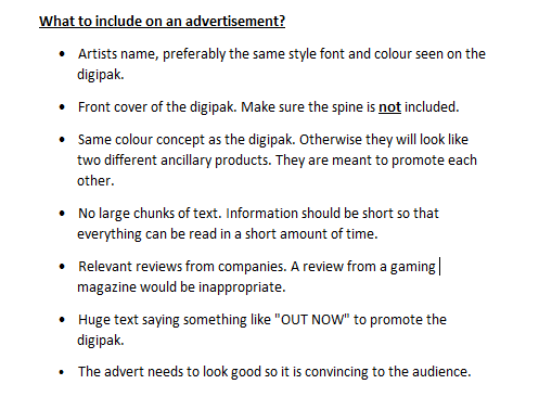
Digipak and Advertisement
Looking back again on my previous blogs, I have done research on the conventions of a digipak and advertisement. There was a time where I created a bullet pointed list which briefly explains the conventions which will be included in my digipak/advertisement. I used this as a guideline during production of my ancillary work.
A real media product of existing artist "Labrinth" and his album cover called "Electronic Earth" is a great way to compare with my digipak in terms of simple conventions such as the font being the correct size. The font chosen for the artists name of "Labrinth" is conventional as it fits in its genre, it is considered stylish looking. In comparison to my artist name font, it is nearly identical and looks like a "maze". The artist's face is shown as the largest of all and the album name is written in a formal matter, just below the artists name with a smaller size font.
Now lets look at another real media product and discuss its relation to my digipak in a more complicated way. I had to always remember that the genre for my chosen music is electronic, so there must be something that relates to this genre whether its the color, theme or font. I have done a blog post which compares my digipak to a real product, with also talking about the ancillary product having a theme.
"I really liked the background as it looks eye catching and the high
wild grey lines could represent the style of the music, as electronic is
a genre of high tempo music. On every electronic digipak/album cover
that I've seen, there's always something iconic on the front cover,
whether it is a puzzling design or an image of the artist which is
filtered in some way (e.g. double vision). I found a design which is
similar to Big Gigantic's "Rise And Shine". It is not identical but do
share some concept within them. My one is a bit darker and is a mixture
of grey and black whilst Big Gigantic's one is black and white".


