

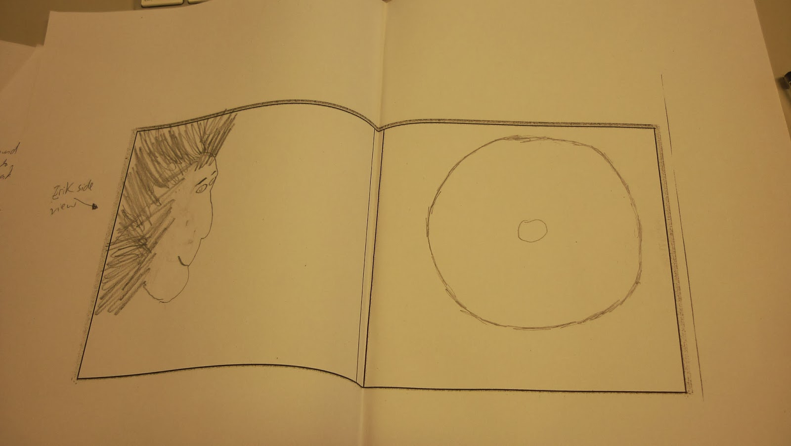
Above is a mock up of my 4 panel digipak in which I have pitched to Rebecca about it. As you can see from the photograph that i have annotated everything that will be on the front and back cover. For example, the album name "Hotel october" will have a font style of "Vermin Vibes 2" which I feel suits the genre of electronic. Feedback and advice from Rebecca made me get rid of the picture of Ruth in the background since I am promoting the main artist and not the one featuring in the song. The track list on the back cover is copied from the original album of our song (SBTRKT) as this makes it easier and normally people would come up with bizarre track list names. Overall, there are some developments that need to be made such as the inside panel as it looks too simple and a repetitive picture of Erik on every panel would be boring. I will consider using trial and error on choosing which background will be suitable when i create my digipak using photoshop. I also did not forget about the spine of the CD, in which the name of the album and artist will be presented here.

As you can see, my mock up advertisement looks messy since I am very bad at art. However, there are some positives such as the following of conventions. The main artist (picture) is shown very big and clear so it the audience recognises the artist in the advert. Rebecca said that i have used too much information and the advert should only either include rating/reviews or tour dates and they shouldn't be shown together in one poster. I will change the size of the advert to a small landscape one which will fit in a magazine as half rather than a full page. I will scrap the reviews/ratings and stick with the tour dates.
No comments:
Post a Comment